How to Analyze a Trading Chart: A Step-by Step Guide
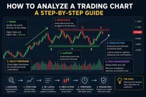
Meta title: How to Analyze a Trading Chart: Step-by-Step Guide
Meta description: Learn how to analyze a trading chart using market structure, support and resistance, price action, volume, and multiple timeframes.
How Do You Analyze a Trading Chart?
A trading chart contains a huge amount of information, but you don’t need to analyze every indicator or draw dozens of lines to understand it.
A better approach is to analyze the chart in a specific order.
Start with the overall market structure, identify important price areas, examine recent price action, and then consider possible scenarios.
This guide explains a simple framework you can use whenever you open a new trading chart.
1. Start With the Market and Timeframe
Before analyzing individual candles, identify exactly what you’re looking at.
For example:
- BTC/USD on the 4-hour chart
- EUR/USD on the 1-hour chart
- AAPL on the daily chart
The same asset can look completely different depending on the timeframe.
A bullish move on a 15-minute chart may simply be a short-term bounce inside a larger bearish structure on the daily chart.
That’s why the first question should be:
What is happening on the larger timeframe?
2. Identify the Overall Trend
One of the first things to look for is whether the market is:
Trending upward
Price generally creates higher highs and higher lows.
Trending downward
Price generally creates lower highs and lower lows.
Moving sideways
Price remains within a relatively defined range.
Here’s a simple way to think about it:
| Market structure | Typical characteristics |
|---|---|
| Uptrend | Higher highs + higher lows |
| Downtrend | Lower highs + lower lows |
| Range | Price moves between relatively defined areas |
Don’t assume that a market will continue in the same direction simply because it has been trending.
Your goal is to identify the current structure, not predict the future with certainty.
3. Mark Important Swing Highs and Lows
Now look at the major turning points on the chart.
A swing high is an area where price moved upward and then reversed or pulled back.
A swing low is an area where price moved downward and then bounced or reversed.
You don’t need to mark every small movement.
Focus on the swing points that are clearly visible and have influenced subsequent price action.
These points can help you understand the structure of the market.
4. Find Support and Resistance
After identifying the major swing points, look for important support and resistance areas.
Support
A price area where buyers have previously appeared and price has reacted upward.
Resistance
A price area where sellers have previously appeared and price has reacted downward.
Don’t necessarily treat support and resistance as exact single-price lines.
In many situations, they are better viewed as zones.
For example, instead of saying:
Resistance = $65,000
you might identify an area around $64,800–$65,300 where price has repeatedly reacted.
This gives you a more realistic view of how markets behave.
5. Look for Breakouts and Failed Breakouts
Once you’ve identified important levels, examine what happens when price reaches them.
There are several possibilities.
Breakout
Price moves beyond an important level.
Rejection
Price reaches a level but moves away from it.
Failed breakout
Price moves beyond a level but then returns back inside the previous range.
A failed breakout can be particularly interesting from an analytical perspective because it tells you that the initial move did not hold.
However, a breakout or rejection is not automatically a trading signal.
Context matters.
6. Analyze Price Action
Now zoom in and examine how price behaves around the important areas you’ve identified.
Instead of looking at individual candles in isolation, ask:
- How quickly did price reach the level?
- Was the move strong or weak?
- Did price consolidate?
- Was there repeated rejection?
- Did the market break the previous structure?
- Did the breakout hold?
This approach is generally more useful than simply asking whether the latest candle is green or red.
7. Use Multiple Timeframes
One of the most common mistakes beginners make is analyzing only one timeframe.
A multi-timeframe approach can provide additional context.
For example:
Higher timeframe
Used to understand the broader market structure.
Intermediate timeframe
Used to identify important areas and recent structure.
Lower timeframe
Used to examine more detailed price action.
You don’t have to use a particular timeframe combination.
The important idea is:
Don’t interpret a small move without understanding the larger context.
8. Add Volume When It Makes Sense
Volume can provide additional information about market activity.
For example, you might compare volume during:
- Breakouts
- Strong price movements
- Consolidation
- Reversals
A price movement accompanied by noticeably different volume can provide additional context.
However, volume should not be interpreted independently from price action.
9. Check Your Assumptions
This is one of the most important steps.
After creating your initial analysis, deliberately try to find evidence that could contradict it.
Suppose your initial view is:
“The market appears bullish.”
Ask:
What would make this view invalid?
Maybe the market breaks an important swing low.
Maybe a breakout fails.
Maybe the higher timeframe structure contradicts the lower timeframe movement.
This process can help reduce confirmation bias.
10. Create Two Possible Scenarios
Instead of trying to predict exactly what the market will do, consider multiple possibilities.
For example:
Scenario A
Price holds an important support area and continues higher.
Scenario B
Price breaks the support area and the current structure changes.
This way, you’re not forcing yourself to believe that only one outcome is possible.
The market can behave differently from your initial expectation.
11. Review the Risk
Before considering any trading decision, ask:
- Where would my analysis be invalidated?
- How much capital could be at risk?
- Is the potential reward reasonable relative to the potential loss?
- What assumptions am I making?
- What information would change my view?
Risk management should be considered separately from the desire to predict the next price movement.
12. Write a Simple Chart Analysis
After going through the previous steps, summarize your analysis.
You can use a template like this:
Asset:
Timeframe:

Market Structure:
Uptrend / Downtrend / Range

Important Support:
-

Important Resistance:
-

Current Price Action:
-

Potential Scenario 1:
-

Potential Scenario 2:
-

What Would Invalidate My Analysis:
-

Main Risks:
-
This makes your analysis easier to review later.
Common Trading Chart Analysis Mistakes
Using too many indicators
More indicators don’t necessarily mean better analysis.
Ignoring higher timeframes
A short-term setup can look very different within the larger market structure.
Drawing too many support and resistance lines
If everything is an important level, nothing is.
Treating every breakout as confirmation
Some breakouts fail.
Trying to predict every price movement
A good analysis doesn’t need to predict every candle.
Ignoring the possibility of being wrong
Every market hypothesis should have conditions that could invalidate it.
What If You’re Not Sure About Your Analysis?
Sometimes you’ve looked at a chart several times and still aren’t sure whether you’ve interpreted it correctly.
That’s where a second opinion can be useful.
Instead of asking someone:
“Will BTC go up or down?”
a better question is:
“Did I interpret the market structure correctly?”
or:
“Did I miss an important support or resistance area?”
A chart review can focus on the reasoning behind your analysis rather than attempting to predict the future.
Get a Human Second Opinion
If you’d like another perspective on your chart, you can submit:
- Your chart screenshot
- The asset/symbol
- The timeframe
- What you’re trying to understand
- Your own interpretation
A reviewer can then look at the chart and point out areas that may deserve further attention.
[Submit Your Chart for Review →]
The purpose is to provide an educational second opinion, not a guaranteed prediction or instruction to buy or sell an asset.
Final Checklist
Before considering your chart analysis complete, ask yourself:
☐ Did I check the higher timeframe?
☐ Did I identify the market structure?
☐ Did I mark the major swing highs and lows?
☐ Did I identify important support and resistance areas?
☐ Did I examine price action around those areas?
☐ Did I consider more than one possible scenario?
☐ Do I know what could invalidate my analysis?
☐ Have I considered the risks?
If you can answer these questions consistently, your chart analysis becomes much more structured.
Educational Disclaimer
Trading financial markets involves significant risk. This article is provided for educational and informational purposes only and should not be considered financial, investment, or trading advice. A chart review does not guarantee any particular market outcome.

بازدیدها: 5